
Rebuilding enterprise billing based on research and customers’ mental models
A content-heavy project that included creating or updating content for all flows, headers, subheads, labeling and CTAs, new information architecture and navigation naming conventions and an empathetic approach to some sensitive aspects of billing, such as restrictions and payment failures.
Legacy designs vs new prototype improvements
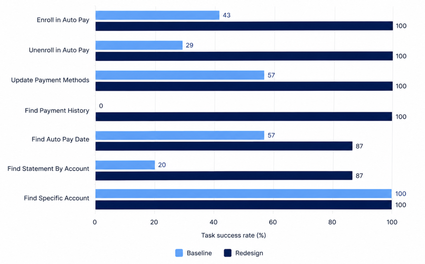
Baseline testing vs. updated usability testing - task completion skyrocketed due to label changes and design updates
Post launch analysis - every tracked billing behavior improved, with paperless billing enrollment up 145%
Billing refactor
How do you begin a redesign of a billing experience that isn't technically broken, just not great? That’s where we found ourselves at the start of this project.
Customers could still pay their bill, download their statement or enroll in Auto Pay, but too many support calls to help customers with billing tasks were being made, and we knew we could offer a better online billing experience.
The experience had grown the way most legacy features grow. Each release layered new features onto an old foundation, terminology wasn’t governed, designers transitioned on and off and development often stepped in for error messages.
Many enterprise customers also manage multiple billing accounts at once, which wasn’t always streamlined and efficient.
I led content design for the cross-functional redesign that followed. In prototype testing, most redesigned flows hit 100% task completion. In the 25 days after launch compared with the 25 before, one-time payment starts rose 26%, Auto Pay enrollments rose 10% and paperless billing enrollments rose 145%.
My role
I led content design end to end. On this project that meant strategy and structure as much as individual words. Information architecture, naming conventions, page hierarchy, table labels, system and error messaging and the patterns that connected one flow to the next. Every message in the redesign was mine to write, review or edit.
I partnered with product design, research, engineering and accessibility, and several of the standards we set during this project now live in our style guidelines.
Research was critical in understanding task completion rates
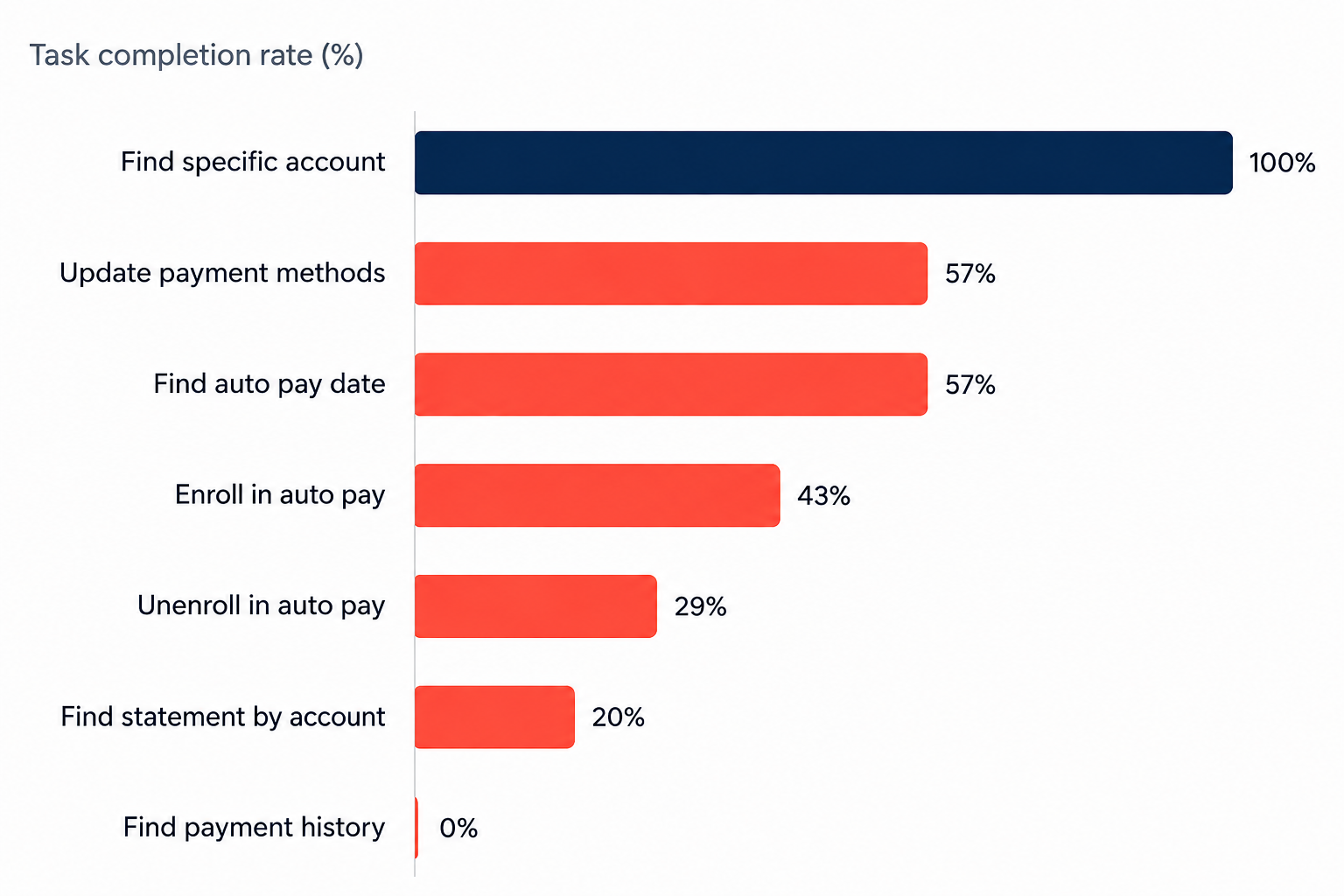
Before we started, researchers benchmarked the existing experience through unmoderated usability testing. We tested the ability to:
find a specific account
update payment methods
find auto pay date
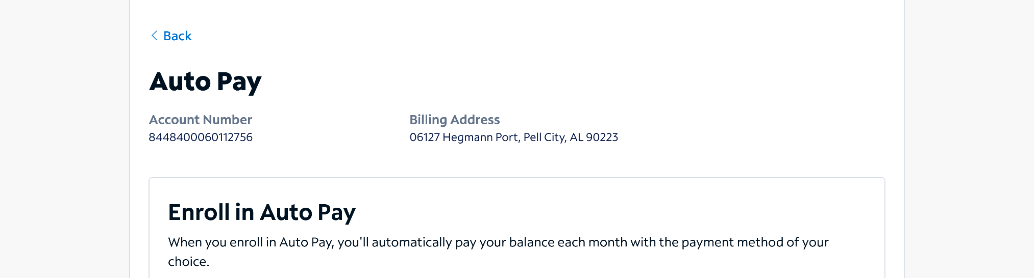
enroll in auto pay
unenroll in auto pay (a big call driver)
find statement by account number
find payment history.
The task completion rates showed that outside of finding a specific account, all were failing. Several of our worst findings were around architecture, hierarchy and interaction problems.
Other insights we learned were
60% of participants expected their balance to update immediately after a payment
80% missed the message explaining it could take 24 hours.
71% couldn't find how to unenroll from Auto Pay. The option lived inside a page turn in a pretty invisible CTA.
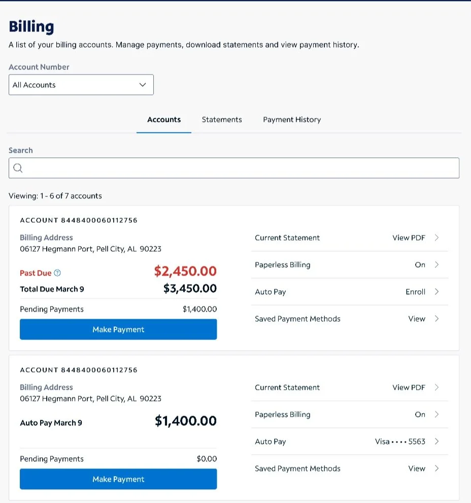
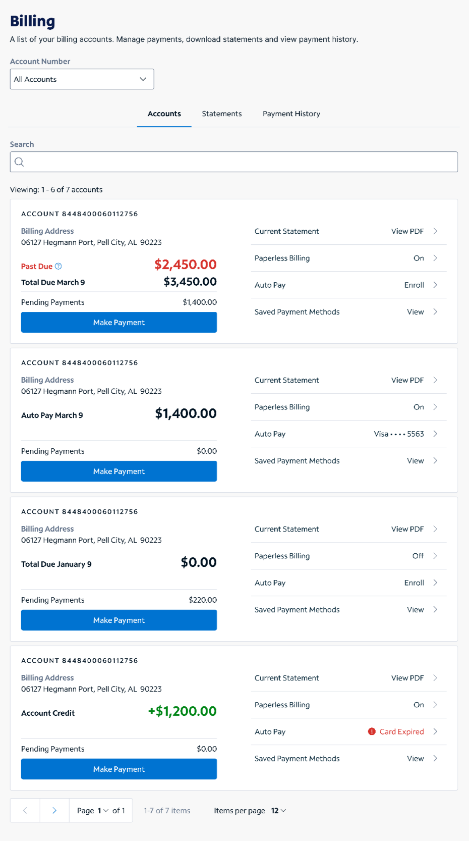
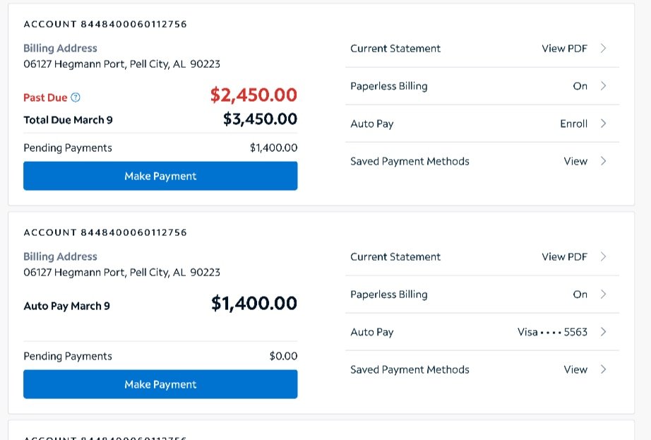
We also knew our customers identify their accounts in two different ways: 50% by the account number and 50% by the billing address. The UI sometimes showed both, as seen here on the pre-design example, but once a flow was started, it was one or the the other. This was a must-fix.
The design strategy focused on five heuristics
Visibility of system status
Error prevention
Recognition rather than recall
Aesthetic and minimalist design
Recognize, diagnose and recover from errors
That meant we knew:
Customers should always know which account they're reviewing or taking action on.
Essential payment options such as unenrolling Auto Pay should not have to be searched for.
Terminology should be consistent. Period.
Actions should have predictable labels and patterns. Everything should be as minimal as possible while still being clear.
Error messages should be clear, empathetic and provide an out.
Applying this across accounts, statements, payment history, Auto Pay and saved payment methods would make a cohesive billing experience.
Workshop to define direction and strategy
Who: Design leadership - director, principal content designer (me), principal product designer
How: We each started with a blank card component in Figma and were asked to re-imagine the account summary card. We time boxed for 20 minutes.
Results: We were all pretty aligned in what should be on the cards and what hierarchy we should test
Product designers focused on more “pixel perfect” vision
I (content design) focused more on hierarchy, brevity, clear labeling and CTA
Testing the early IA redesigns
Before we got too far, we iterated by:
Display account number with billing address for recognition across tasks.
Show past due only when relevant to reduce noise.
Present pending payment amount after payment.
Add direct launch points to eliminate the details page.
Bring Auto Pay forward for faster access.
Task success rates improved across every tested billing task. Simplifying the information hierarchy and surfacing key actions from the card itself made the experience more efficient to navigate.
Designing for recognition over recall
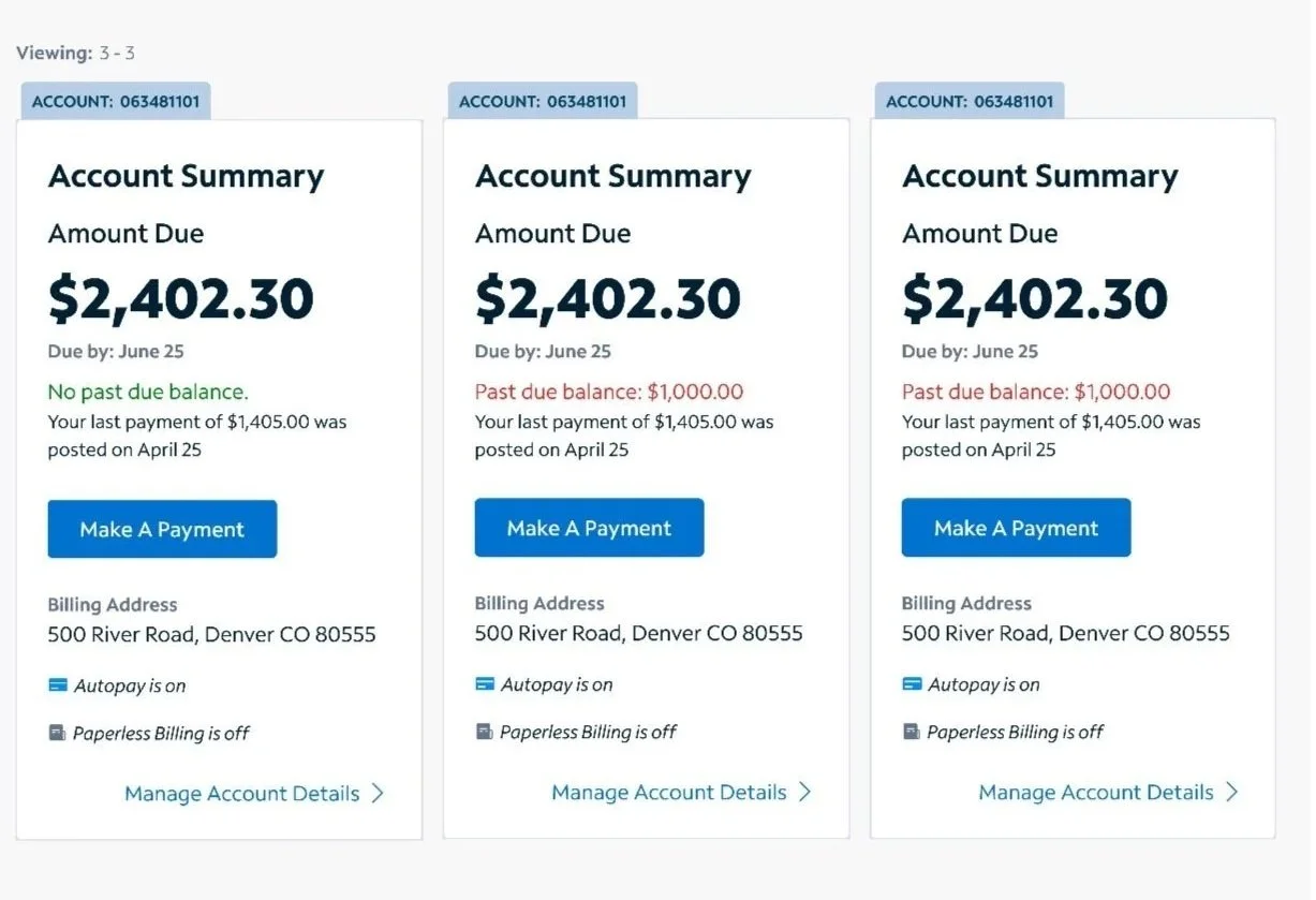
Account orientation became one of the main focuses. We created a header of sorts, pairing the account number with the billing address at the top of every actionable flow. This way, both mental models could confirm where they were at a glance and neither had to hold anything in memory. This was particularly helpful for customers with many accounts.
The same heuristic reshaped Auto Pay. We moved it out of the hidden menu where 71% of participants couldn’t find it, and replaced the generic On/Off with an invitation to enroll, or with the enrolled payment method itself, so customers could see not just that Auto Pay was on but which card or bank account was connected.
We also heavily focused on pending payments, due to research findings. While our billing structures don’t allow for an instant update, we added a pending payment section on the billing cards for that instant visual of payment made.
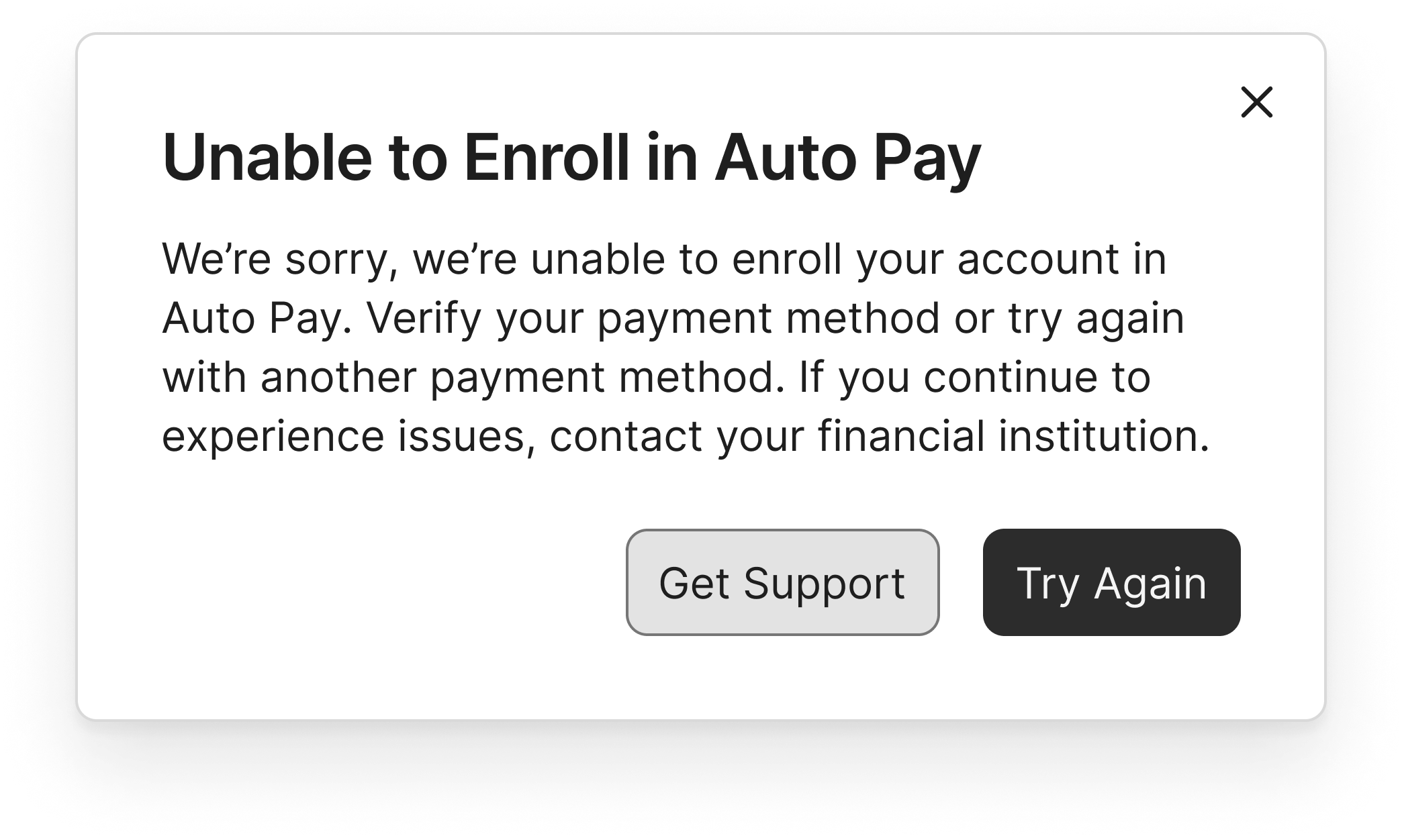
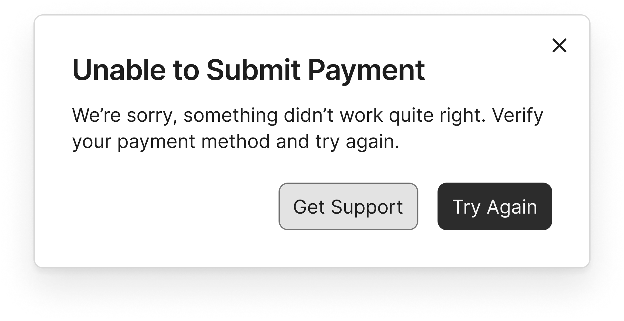
Contextual messaging for every failure state
Billing fails in more ways than most products. Restricted payment types, restricted accounts, inactive accounts, credit card limits and restrictions that can change daily.
Tone mattered the most here. I learned:
The customer is not always at fault when a payment is blocked.
Sometimes we are to blame. Convoluted processes can mean misapplied payments.
Sometimes a mailed payment is still in transit while the system shows a balance due.
The original messaging blamed by default by using “only allowed” and “not allowed”.
I worked with engineering to get a complete inventory of approximately 13 API failure responses. Then I mapped every state to a contextual, helpful message. The updated messaging removed blame or owned it ourselves, and always gave the customer a next step.
Precision mattered even in inline error messages. An empty account number field inline error message asks the customer to enter one. An incorrect entry asks them to double-check it. Two states that were once identical now tell the customer exactly which problem they have.

Greater impact by setting content standards
Some of the highest-leverage work in the redesign was setting content standards.
I renamed the "Bills" page to "Billing" and added introductory copy under the H1. In an earlier study, we saw 76% of participants using that copy to ground themselves in what a page could do. Sounds simple enough, but this wasn’t consistent.
Pagination labels now name the object being counted, so "1–13 of 70 payments" replaced an ambiguous "items."
I advocated for right-aligned dollar amounts so aligned decimal points make for easier scanning. This alignment is now a standard.
For redacted data, I proposed mid-line ellipses, and that formatting is also standard.
Decisions in this project became standards we still apply.

Initial descope
Not everything survived architecture discovery. While research showed customers expected a pending payment to appear immediately, displaying it on the landing page across multiple accounts carried API work that the budget and timeline couldn't absorb.
Leadership descoped it displaying on the billing landing page cards for initial launch, but kept it in the table.
It has since been added.
Outcomes
Earlier testing showed dramatic improvements in all tasks tested. Comparing the 25 days after launch with the 25 before, some notable changes were:
One-time payment starts rose 26%
One-time payment completes rose 9%
Auto Pay enrollments rose 10%
Statement downloads rose 4%
Paperless billing enrollments rose 145%
Reflection
Benchmark before you redesign. The baseline study turned every design decision into one the data could answer.
Dig into mental models. Half our customers thought in account numbers, half in billing addresses. Confirming this shaped the information architecture and content hierarchy in every actionable flow.
Document small decisions because they may become standards. For example, using midline ellipses for data redaction is now a guideline we can point to if questions arise.
Appreciate your team. This was a true cross-functional collaboration and our retro felt like a celebration of a job well done.